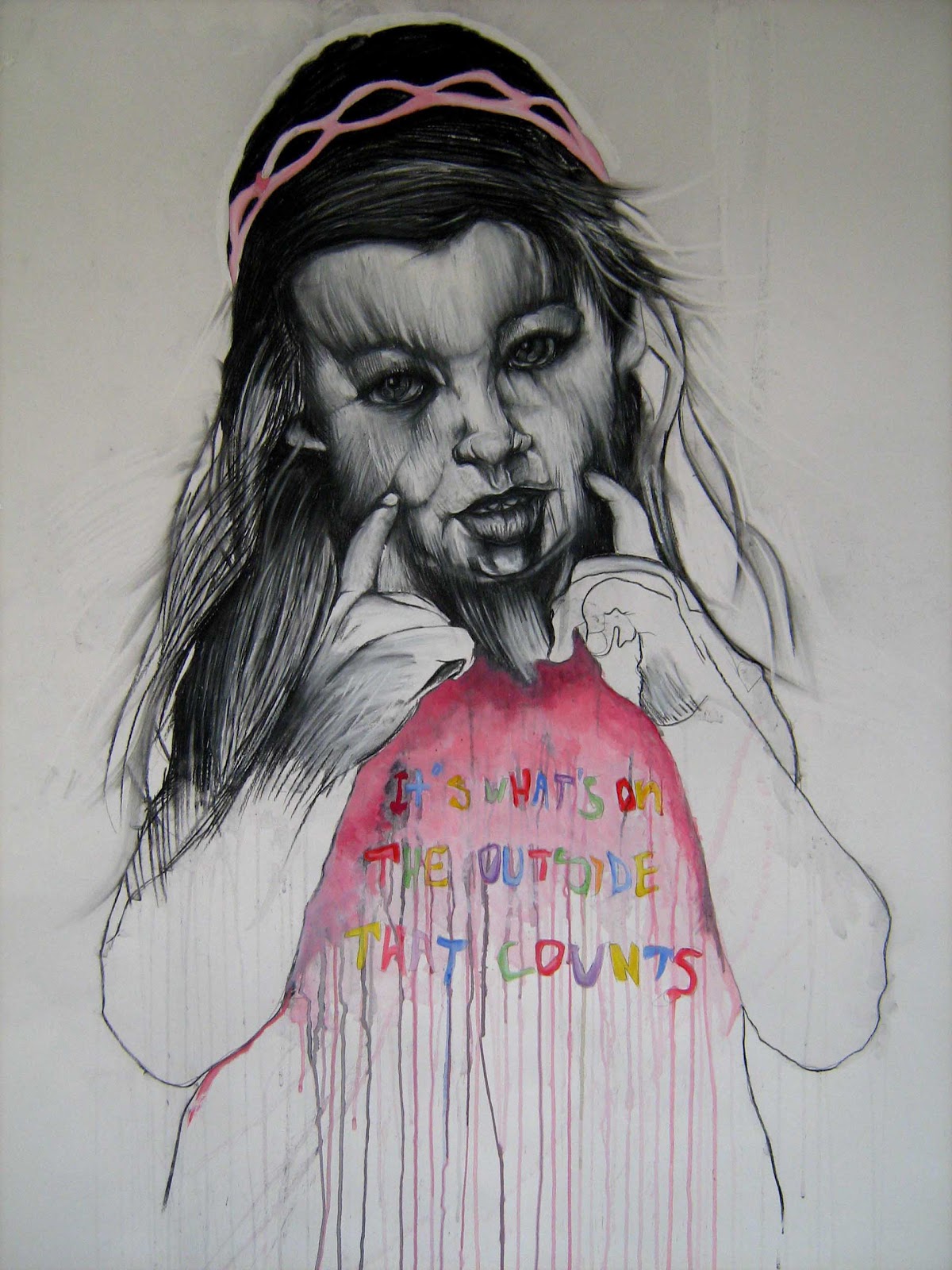

Following on from Alexis Marcou’s intriguing manipulation of light and glass effects, it would seem rude to not also acknowledge the work of Carne Griffiths, an artist whose experiments with drawing textures are equally mind-blowing.
Now, having read a plethora of articles on Carne, I’ve spotted an impressive string of reviews, all of which rather remarkably resemble one another - save for an oh-so-smart rephrasing of about three words. Sort of like casual plagiarism.
Don’t have it, Carne.
You have the sort of talent that deserves – no, demands, better. So I’m going to have a go at actually considering your work and hopefully deliver something insightful and fresh to think about.

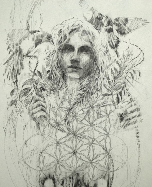
Carne is interesting because he intersects traditional themes of nature and floral aesthetics with harsher and more graphic techniques. I mean, you can't get much starker than flowers overlaid with shards of shattered glass, can you?


I’m going to avoid a predictable interpretation here and explore one which I assure you manifests from a clean state of mind. For me, Carne's work exudes an air of sexual fertility and fecundity, sexual devouring; innocence intertwined with a boundless and liberated sexual violence. Like each work presents a new femme fatale. Perhaps what we’re feasting our eyes on here are suspicious heroines from an existent Garden of Eden?

By delicately dealing with Nature's thornier side, Carne unconsciously rips us out from the realm of watercolour landscapes as we know it and in turn subverts the traditional worship of nature's benevolence in art. Carne reminds us of mother nature’s equally deceptive and nightmarish qualities, in order to show [cue circa GCSE analysis] man’s relative insignificance and powerlessness.


Carne achieves the distinction by using a base layer of sepia-toned tea bleaching techniques, over which he articulates and exploits compartmentalised layers of striking and unexpected colour. Carne then adopts a technique which I, coincidentally, have been exploring for the past year in my own work. Carne modifies the mercurial and chaotic behaviour of the bleach splats with repetitions of abstract and structured geometric lines:


The uncontrollable nature of the bleach injects a level of risk into each piece which is what stops Carne's work ever falling stale, tipping each work in the tense balance between success and disastrous failure. As such there is a strong sense of abandon and escapism here, free from the restraints of traditional compositions, leading both the artist and viewer on a journey to an unknowable destination. The thrill lies in the process, not the result.

That said, the results are still bloody exquisite, producing highly seductive textures which can only truly be flirted with at close proximity:


Interestingly, I originally discovered Carne as a featured illustrator whilst stumbling through Rankin's new bi-annual, Hunger Magazine. It just goes to show the kind of versatile appeal Carne's work has to offer. I could quite easily imagine these illustrations as prints for graphic tees.
Oh wait...

It's no surprise Hunger wanted him. Carne's fashion attraction is clear, with clothing label Twinne having picking up his designs for a new series of printed tees. Carne's solo show, 'Fragments', will be showing at Ink'd Gallery in September.
Time to put the kettle on.
Oh wait...

It's no surprise Hunger wanted him. Carne's fashion attraction is clear, with clothing label Twinne having picking up his designs for a new series of printed tees. Carne's solo show, 'Fragments', will be showing at Ink'd Gallery in September.
Time to put the kettle on.


No comments:
Post a Comment